
Hey! I've posted a little in the chat but Fleming said I should post here too.
I think the new UI is really slick, but I have some gripes, so here they are:
- Unit icons act funny. They don't represent where the army is actually located, which is confusing. For example:
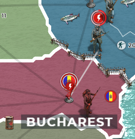
My army is attacking Bucharest, but appears to still be in Ukraine. It's easy to tell what's going on with a detailed look, but this is a major downgrade from how easy to understand the map used to be.
- My flag is squished. It used to scale properly, but now it appears laterally squashed and heavily compressed, which makes it hard to see the details on it. I made it specifically for this purpose, so I'm sad that it's not displaying properly.

Compare to:

- I would really like the option to revert to 2D icons for units. The 3D models are pretty cool, but it makes it hard to see big menacing stacks. The models could also be shrunk at max zoom; they take up a lot of space.
Bearing in mind that the backend is the same made it pretty easy to adapt to the new UI for me.
I love the more modern feel of the UI and the map in particular feels nice to navigate, though I would like more control over the colors and icons. The barbed wire between warring nations is a great touch.