
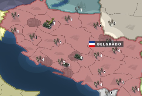
Corrections made in the latest update are appreciated. The provincial administration is much better than the previous one. The reduced size of the unit label now allows a better view of the map, however, as mentioned in the medium zoom level, the label is seen at a very small size, which makes it difficult to see the number of units; to be able to distinguish well you need to zoom in on the troops. 3D models appear larger than the label and in small countries the 3D unit ends up obstructing the map like the previous label did.
In my opinion, this is on the right track and the commitment of all designers and also all administrators in filtering our requests is appreciated. I keep commenting that the general problem of the Revamp revolves around the units. The map can be heavy or light, with or without 3D effects, with more brightness, lighting, with stronger or opaque colors, but the main thing that should be highlighted is the units.
I would like to contribute some ideas regarding this.
For example, for the high graphics mode, the 3D model could be kept and accompanied by unit numbers that stand out on the map on a transparent label that does not obstruct the terrain.
Another case would contemplate the incorporation of a tactical army either in the reduced graphics mode, for those nostalgic for the legacy, or for the game in general; In this way, when the combats are on a large scale with the participation of numerous units, the player will have the option of changing his army to the tactical version. In the legacy there was this option that returned the troops to simple pins.
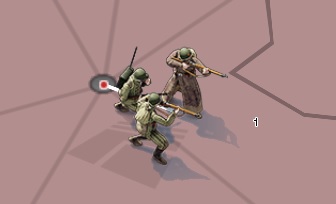
This time the tactical army could be similar to the legacy, implementing its unit tag as was done when the Revamp was unveiled.
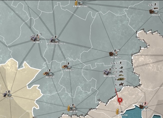
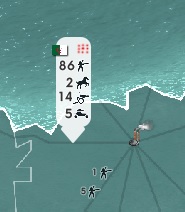
If it is not possible due to programming problems, the design of a label with the graphic elements of the Renovation would be seen as indicated in the following image but clearer.
Attentive to any suggestions, I hope that these proposals come true.