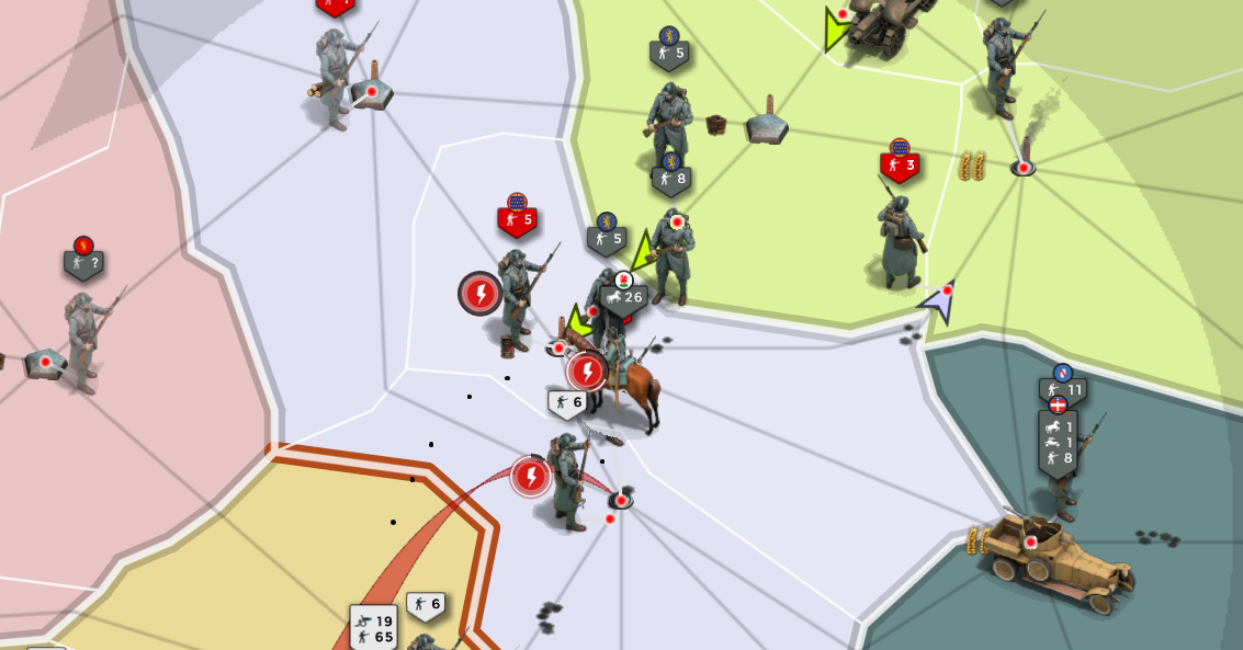
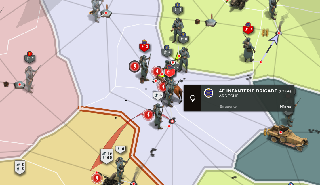
An option to hide the big unit images on the map is already planned, I expect it in the near future (thanks for your patience on that one!). The labels will also try to point to the exact position of the unit then and not just float in the air. Unless many are in the same area and overlap, in that case labels are spread out for readability and the line connects them to the actual position.
EDIT:
Better listed realistic suggestions:
1- Add a way, or just plain out, make the numbers for units bigger on the map, they are a tad smaller than on the Legacy Mode and they are just a bit hard to read easily, so having it bigger, or the option to make it bigger would be huge.
2-The big units (or 3d models) thing has already been commented on.
3- Make unit stacks again. Like on legacy, now you only see the 3d sprite of the "most important unit" (I have no idea how its selected), I think it would be better to have like on legacy where you just had stacks of the units with their respective amounts. Right now its not so far from it but its all lumped up in a white box and again, hard to see what is what and their amounts, I think to have them a bit more separated or discernible would also help a lot.
4- Bring back the old shades for the borders, it just looked better and again, helped the "reading" of the map, or at least make it an option, im sure its not easy but as I say, I think its one of the biggest differences, its a subtle one, but it has big impact. (colour of the country is deepened at the border)
5- I have no issue with the new 3D models (although I prefered the old ones) of buildings, but they are just way to tiny and hidden, railroads, factories and ports are much less visible, which makes the game much much less rewarding, which also affects engaging playerbase because well, what game doesnt want to be rewarding right? So if 3D sprites are staying just make them bigger and more noticeable. Most crucially those 3: ports, factories and railroads. Forts could also be more visible, or again, at least a bit bigger, same goes for the flames (or smoke) that comes out of a region that is low on morale. Everything around this aspect is just too small and seems like a minor detail on the map when in reality they are a huge deal.
6- (This is more of a bonus) I know its probably never coming back but another thing that not only made the game more rewarding but also easier to manage was the ability to go into provinces (when you clicked on them and you got that square miniature of it and you could manage buildings from there). I have met a few players that liked the new UI more but still wish they had that tiny little miniature province, although im guessing its hard to implement into the new UI.
7- Another huge impact on visibility, make roads more visible, it seems to be a trend with this new UI that things are more subtle and less visible. I get it looks smoother but really impacts gameplay. Roads need to be more visible, maybe a deeper colour or just thicker? Please make them more visible.
I think if those 6-7 things are improved upon, its a MASSIVE leap foward. Those are the key points I could find right now, if I come up with more I will post but I doubt they will ever make it into the game, but here is to hoping.


