
I would like to start this topic with saying that I am really happy about the team doing changes in such major ways. Now having said that, please do not make the map so dark, keep the old animations if its possible, currently having 12+ bombers and 10 fighters I cannot tell what I have in this air squad. I like how the interface feels but color wise and the army pictures I got to say the "supremacy" style is what kept me involved so far. This looks like the other WW2 game, and it just didn't feel right.

New Look discussion
- SpartanBG
- Closed
-
-
Agreed that colours feels strange when in-game, but personally my only concern about them is the user being able to see the information of the game clearly no matter the colour, and that's not 100% accurate by now so it needs some improvement.
i also agree the game looks just like Conflict of Nations, i never liked its style, let's see if with the few differences between them i can handle it in s1914
-
Look at the other thread lots of input in there.
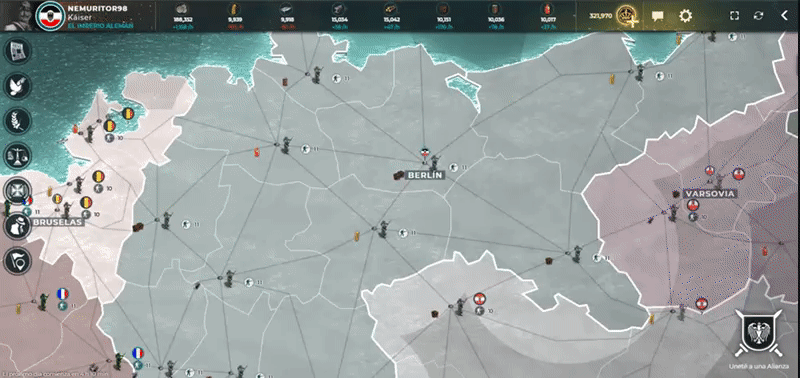
It's not just the weird 1982 Tron like look and feel. Much much more critically it's really hard to see what's going on with the new icons. I can't easily see where they are and I can't see how many are stacked.
On the look and feel I think we've now lost the "retro" 1918 vibe which made the game feel so cool.
The interface is now similar to CoW which I play briefly when it came out but ultimately abandoned as it just wasn't as much fun as S1918.
I DO APPRECIATE all the efforts of the team in making these enhancements but for me they don't work. (More details on the other thread). Again sorry guys,.
-
I agree with SpartanBG, colours on the new map looks all really similar, it is not obvious to whom which province belong.
Also troops icons are really hard to identify. I find it not really userfriendly. I also think that resource icons on map should be bigger as like as province names and buildings a little bit, without zooming I can´t say which lvl of fort I have in which province.
-
Hi Guys,
I know quite a few things you have mentioned above have already been raised to the Dev Team to be looked into.
Over the next few days/weeks you will see the updates happening. It would be great if you can give some feedback as they happen.
-
will be happy to give feedback to you guys, Supremacy do deserve to be acknowledged again, Its a great game.
-
Yep I'll be more than happy to give feedback too. I keep "popping in" to the new version but I still can't get on with it.
Looking forwards to the update.


-
On a side not are you guys considering to keep up the Legacy version up?
-
On a side not are you guys considering to keep up the Legacy version up?
not an option to keep the legacy version, if it goes like it was in 2014 when changing from java to html, the legacy may be up for a few more months or less
-
I really do love how it looks and feels, hope you guys manage to incorporate it better within the new version
-
ok me again, I agree with most of the comments a lot have already given, but one thing I would like to mention is the chat.
I am not a big user of the in game chat, and keep it closed almost permanently. However now I have an ever increasing counter of unread posts which is becoming irritating as the only way to remove it (that i can see) is to open the chat and click on each of the channels until you have 'read' them all. I would very much like to see an option to turn off that particular notification as there are 100s of messages each day and it would be very rare any of them are related to a map I am playing. I know I am not the only player who does not use the in game chat.
I would also like to comment on the new tiled home page. I know tiles are the new way of the world and there appears to be no escape but if that's the way we are going can we also follow the suit of other applications that allow you to chose which tiles you want to see? While I am sure the current player of the week loves being front and centre of everyone's home page, he may well be the only one. I don't mind it being displayed somewhere less prominent but there are more important things I would like to see that relate directly to my own game. There is already a tab for ranking so anyone who is interested can easily click on that. Most gamer's are much more interested in seeing their own personal successes rather than someone else's so maybe more info around the awards earned, or maps being played would be appreciated more.
-
I am not a big user of the in game chat, and keep it closed almost permanently. However now I have an ever increasing counter of unread posts which is becoming irritating as the only way to remove it (that i can see) is to open the chat and click on each of the channels until you have 'read' them all. I would very much like to see an option to turn off that particular notification as there are 100s of messages each day and it would be very rare any of them are related to a map I am playing. I know I am not the only player who does not use the in game chat.
I was waiting for someone to mention it xd, I as mod offcourse use the chat a lot and like the future but maybe it could be an option to hide it for those who wish to not use it. I do however think the set up is to draw the new users to chat.
-
I was waiting for someone to mention it xd, I as mod offcourse use the chat a lot and like the future but maybe it could be an option to hide it for those who wish to not use it. I do however think the set up is to draw the new users to chat.
Unfortunately the new look chat is even more obtrusive than ever, bigger with no way to resize. The main reason I kept it closed in the legacy environment was because it covered too much of the map, now it covers around 3x more than before even more of a reason not to use it. It might suit people who log simply to chat which I know some do but for me I'm afraid it really serves no use. Almost all groups who play regularly use a different chat application such as skype, discord or messenger so you may be fighting a losing battle to get them to use the in game chat.
Happy to leave it closed and go to it on the odd occasion I am looking for a mod but that count of unread messages is going to annoy a few I should think.
-
Happy to leave it closed and go to it on the odd occasion I am looking for a mod but that count of unread messages is going to annoy a few I should think.
It does indeed cover quite a bit. I think it's mainly good for new users, Being dropped in skype and discord takes knowing people already chat is an easy way to learn to know more people. Regardless I know it might annoy some users yes just like that notification some get for not having joined an alliance after the 5th time they know they can join an alliance they just don't wish to
-
if you have more than 1 unit, it shows the total numer of units, but if you have just 1 it doesnt show the number
it does seem confusing to me, you either use the numbers or you dont, at first sight i thought there were no units there as I was still processing the info on the way it worked when the system always kept 1 infantry per city
-
if you have more than 1 unit, it shows the total numer of units, but if you have just 1 it doesnt show the number
This is actually done on purpose. With all those scouting infs being scattered on an average S1914 map the army stack infos would just clutter the whole screen. That's why we decided to remove the counter for this case only.
-
This is actually done on purpose. With all those scouting infs being scattered on an average S1914 map the army stack infos would just clutter the whole screen. That's why we decided to remove the counter for this case only.
i guess i'll get used to it but

-
So far I had only had one map open and played others on legacy mode, so today is the first time I have tried to open more than one map - but you can't
I had assumed as you open maps you would then be able to scroll through them giving quick and easy access to all you wanted open - when the action starts you often need to be able to keep checking maps often. My previous way would have been to have each map I wanted to keep an eye on open in a different browser tab. The new interface does not allow this, instead you have to reopen each map in the same window. This is lower, much less convenient and could easily lead to unnoticed attacks / miss opportunities where a map is missed because it was not open.I know not everyone plays multiple maps - I will generally have up to 10 on the go and at any given time there are probably 5-6 of those I need to be watching. This new interface will make that much harder for any player who plays more than 2-3 maps at a time.
You can keep opening the main page in different browsers and then open a different map in each but this is time consuming and completely negates the point of having a single window application which was one of the advertised improvements ........ ideally what we should have is a way to quickly swap from one map to the next without the need to reload each one.
Another reason this is needed is often is hard to remember which map is which, if you have 2-3 500 maps and then a couple of 31p etc. open each type of map looks the same and has the same name in the list so very easy to lose track of the one you are looking for. It's bad enough I sometimes open 3 maps before I find the one I am looking for but to have to keep repeating it a few times a day will discourage me from starting so many in the first place. If people start playing less maps then that will have a knock on effect to the overall activity in the game.
-
The new interface does not allow this, instead you have to reopen each map in the same window.
I thought it does
http://prntscr.com/lm0p4b
However I do only have 1 game I opened twice -
strange tho