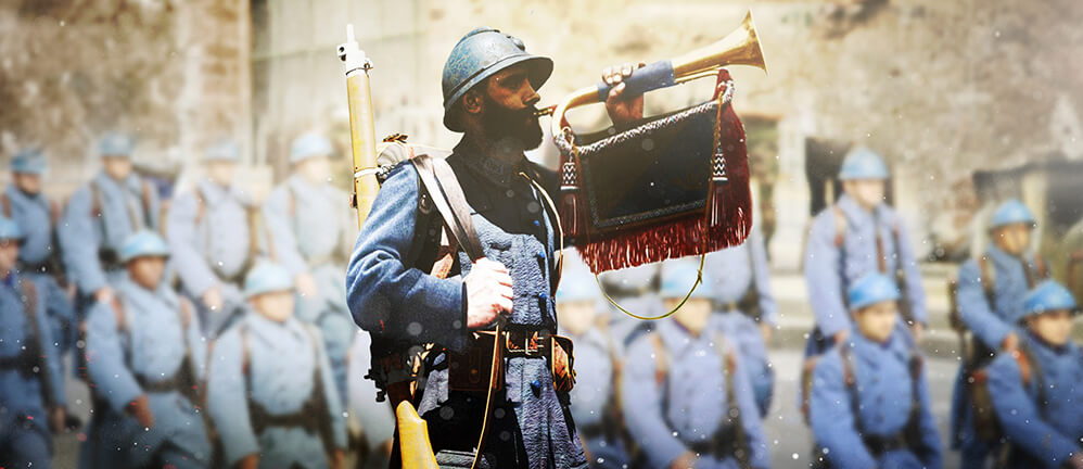
[S1914] Discontinuing Support for “Legacy Mode”

  • 1602157052_news_images_17849.jpg


    Attention, Generals!

    A good strategist knows that using the latest technology is key to victory and that maintaining outdated equipment can become a drawback for all of your troops. The same is true for supporting technology used to play Supremacy 1914.

    Years ago, Supremacy 1914 received a complete visual makeover, designed for a new generation of technological equipment, and reflecting changed user expectations and Zeitgeist. Supremacy is dear to our hearts, which is why we decided back then to keep the old look and feel alive for players who had grown used to it as well as those who hadn’t the technical resources yet to experience the then new Supremacy 1914 as we envisioned it.

    This decision meant that from that point on we needed to maintain both versions of the game, splitting our resources, well knowing that the efforts needed to maintain both would increase over time. We made this decision back then, and would do so again today.

    We also knew that there would come a time when the efforts would no longer be feasible, and this day is approaching.

    We monitored and analyzed how many Supremacy 1914 generals play the game in Legacy Mode the entire time. Looking at how much effort it is for the development team to make sure that the game and all of its current and future features are working as intended in Legacy Mode, we finally came to a conclusion and made the decision to discontinue the active support for Legacy Mode starting in October 2020. Until the end of the year, you will still be able to use it but any bugs exclusive to Legacy Mode won’t get fixed anymore. Also, new features will not be tested for compatibility with it.

    The end of the year 2020 will then finally mark the end of life for Legacy Mode completely.

    If you want to continue playing Supremacy 1914 without the increased risk of experiencing bugs and other inconveniences we recommend to switch to regular mode now.

    We apologize for any inconvenience this might cause for some players, but we are convinced that the freed resources now can be used to fix bugs and develop content for all our players instead.

    Your Bytro Team

  • Arcorian

    Changed the title of the thread from “[S1914] Discontinuing Support - for “Legacy Mode”” to “[S1914] Discontinuing Support for “Legacy Mode””.
  • Thats sad, never liked new one.

    Just cos I like old version. Most likely that was the reason why I return time after time. Simple, nice overview easy to manage. Keep it simple.

    I'm pretty sure I wont play new version of game.

  • A good strategist knows that using the latest technology is key to victory and that maintaining outdated equipment can become a drawback for all of your troops.


    Except if that "latest technology" happens to be nothing but a pile of hot garbage.


    (Side note before what's next: You had your resources bound by fixing a bug every six months? Until the update two days ago when you actually did that, I was seriously under the impression legacy mode was considered unsupported ever since the new UI came out. Whatever "support" you did offer was not really notable to a player, at least to this one.)

    This post is going to go down to you guys as "Salty 'cause things are changing", I know that, I know I can't change that fact no matter how I phrase this. I don't care. But I want the record to show that it's not the fact that the UI will change in general. I'm not even gonna disagree with the notion that it desperately needed at least a little modernization. I'd certainly love it if we had a new, more modern UI that retained the features that set the old one apart from the slew of free2play RTS games out there. It did not though and it failed doing so to a point where you have to wonder whether you wanted this game to become more generic and less of a uniquely enjoyable experience or you really spent not a single bit more of an effort on it than was absolutely required to have a "working" release at some point.


    I don't think it's worth going into the details. When the new UI rolled out two years ago, near immediately pepole pointed out the ways in which it is inferiour from a gameplay perspective to the old one and have been doing so since. You did not care. You did not show any effort to improve the playability of the new UI since its launch by adressing any core issues and complaints. You've been putting out updates that nobody asked for ever since while players were either confining themselves to legacy or straight up leaving because their feedback on the new UI was being ignored. The actual act of playing the game and being able to do so with utmost possible ease has seemingly become a mere side notion to Bytro. The way it appears on the app store real edgy and modern so it gets kids hard over the gritty WW1 game is the main game now. You're free to make that business choice, I know. And as you did, Supremacy 1914 New UI is a worse game than Supremacy 1914 Legacy Design is. Easier to market maybe, but much worse to play.


    You chose to have it this way by rolling out this behemoth of a UI and then ignoring the feedback you've even asked for on several occasions. The major ailments that plague playability are there still. If you want me to show you what I mean, I'll come back and post the kinds of screenshots that have been posted dozens of time. I can even throw in some more that quite clearly show how little "love" and attention to detail even went into the main driver of the new UI, the visuals. They are sloppily made, they overlap when they shouldn't, they clip when they shouldn't, they obscure information. All of this has been pointed out and no apparent effort was made by devs to change any of that. And quite honestly I haven't been keen of supporting this business decision with my playing the game for a while, but at least it was still in basic principle the game I grew to love over nine years of playing and supporting it, so the fun of playing it beat out the fact that I consider many doings of the company behind it to be extremely unprofessional, uninterested, uninspired and very loveless.


    Of course this edges me more simply because I know of a time around here when it wasn't quite like that, when some of the people who had actually poured their blood and tears into making the game what it went on to become were still around and had a genuine relationship with their creation, and new players simply won't. They will just keep joining to find a now very generic game managed by a company that doesn't even care enough to document the updates they do to it properly. Nothing suprising in today's market so I'm afraid you might even get away with it. You've been getting away with it just fine recently from what I hear. Supposedly the game is in its most successful year ever with there being about 10 active members of the community left and everony else just kinda playing. Yeah I know, forum posts don't make you any money, players who want to get involved and help development with bug reports and suchlike don't either, they're just a hassle to you at this point. I get it, don't worry.


    I know that fixing the new UI to be as efficient and convenient as Legacy while still looking modern would at this point be quite a bit more work than a spitshine, which is an amount of work nobody could realistically expect this particular company to invest into this game at this point. I know it would come with the damning implication that Bytro made mistakes when designing it the first place, which is a thing I don't think the company will have.


    /boomer rant


    I hope I can finish at least a few of the games I'm still in and from then, it's just gonna be the memories for me. Memories of nine years of playing, admittedly on and off, seeing the game and the community evolve and devolve, playing with a HC membership while eating nothing but butter on pasta for a week during my college days. Memories of the single one free to play game that has ever captivated me, the single one RTS that had a UI so intuitive, readable, no-nonsensically efficient I actually bothered to become decent at using it. I've reported bugs and issues countless times, I've been a frontline pioneer, I've been among the five people actually helping newbies in the Help chat whenever I've been playing during the last two or three years, answering the same stupid questions over and over again that could have been answered in a tutorial or a manual that is more readily available to new players. Afterall there was absolutely no reason for me to help these guys play and thereby support a game that apparently did not manage to teach them even the most basic mechanics on how it works, which also ain't no failure of mine. But I felt for some reason invested in this game I love and for some reason still wanted it to be the same awesome experience it used to be for me for other players, wanted to help improve it. This is gonna sound pathetic but this game really meant something to me over those nine years. The way this new UI was designed with so little care for detail or gameplay in general actually kinda hurt me. It would have been nice to at least get the decade full but since clearly the new UI will not be overhauled to become attractive to me for the same reasons the old one was, that won't happen. It could probably already be as good if player feedback on it had been taken seriously.


    But it remains a pile of hot garbage to this day. Unless a miracle happens and it becomes a gameplay experience like Legacy with the visual appeal of a more modern game before January for some reason, this is farewell. And I guess it was at least nice to have this thread here to get all of that in before it's over. Knowing I'll leave again soon, this time to not return like I always have before is actually hitting me in the feels.


    I agree you'd have to be insane to read all of that.


    Oh and by the way: Thanks for the super early heads up about this. It ain't like many games typically take longer than two and a half months. Thanks a whole bunch.

  • Arcorian I like to suggest that Revamp (new UI) return the option to have tactical armies display before the Death Blow to Legacy takes place, so many FIX's for something that is not broken... please consider doing this one thing for the community,!


    You have the option still from the initial roll out of the Revamp in 2019, but is it a skeleton from the past and a useless option button, please restore the former glory of S1914 with practical , logical application of hearing what the community wants.

    pasted-from-clipboard.png


    All which agree with restoring Tactical Army display Option to Revamp (new UI) please give Thumbs Up.


    Kind Regards, Hastings TNT

    index.php?eID=image&uid=11763503&mode=2

    Embrace your true nature , enjoy games and have fun!


  • With the new available resources that you guys will receive from discontinuing legacy mode, can you guys bring back the tactical display feature you guys removed?


    I remember when the new UI was introduced and the tactical display feature was available, and I didn't mind playing the new UI because of that feature, but when you devs removed it, I started preferring legacy mode over the new UI.


    I do not understand why you guys removed the tactical display feature. You guys did not even bother notifying the community about it.


    A lot of veteran players are absolutely not gonna like this news (including me after coming back from a long break).

    They are most likely going to quit IMO if you guys removed legacy mode without having an alternative.


    If I do not see the return of the tactical display feature that you guys removed by the end of October I am going to quit the game along with my friends who already did. Such a shame.

  • Having the new mode be the only option will force a great majority of your experienced playerbase out the window, I don't know how this information isn't common knowledge considering most, if not all mods and experienced players I know love and use legacy. I understand the want to have conformed servers but this seems so blind to the fact that your most valued players and community contributors use legacy. The new U.I just simply isn't anything in comparison and it's devastating that this new U.I is touted to be better than Legacy. You'll be saying goodbye to a lot of income from recurring customers that loved Legacy just so you can have a phone playerbase which is overall less invested into the game. To me the only favour the newer U.I has is that it *looks* fancy, but it is unmistakably and patently less friendly and useable for bigger maps like your 100 and 500 map and overall less accurate and concise compared to Legacy.


    This game had so many players come back for legacy, and this decision is a kick to the face for those who have stuck with the game for years.


    Immensely Disappointed

  • I'll be interested to see how many players singing their farewells we can gather in this thread. It couldn't be more obvious that the new UI has glaring issues than when you see all these loyal players here explaining their departure because of it. It's just such a shame to bury this great game under it.

  • Legacy mode allows all players across the economic spectrum (no matter what their financial resources are) to play. The new format uses allot of graphics. Most laptops have a limited to no graphics card (especially an older one like mine). I have tried the new version and the map and all the unit icons do not even show up (too many graphics for my laptop to display) so I stick to Legacy mode. In basic playing, graphics do not matter, it is acquiring provinces and improving the morale of the provinces to gain sufficient points to win the game. Personally, I do not need fancy graphics for that to happen.


    With corona virus impacting the globe as well as the economic job dislocations associated with this pandemic, this is not the time to purposely force players from playing your game/s. Not everyone has the money to go out and purchase a brand new computer or laptop with a high end graphics accelerator card. Request;

    a. do not eliminate the support for legacy mode.

    (1) To Bytro's finance department - perhaps maintain the Legacy system for users but in order to "pay to play" we users pay a small fee similar to the fee for High Command. Example $20USD for six months of Legacy play.

    b. postpone this order until the corona virus has been stopped and the world wide economies recover (the jobs come back and people have more discretionary income). From many reputable source the early projections for this to happen are now into 2022 - 2023 (time for the shots to roll out and a high percentage of the populations to take them and to monitor the vaccine's effectiveness. Once effective, businesses will reopen, masks can come off, and things can return back to quasi what it used to be.)

    Thank you for your time.

    Tyr-Ion

  • Since you guys made this announcement whole community in shock and more than 80%of players have decided to quit this game count me one of them (not bcoz legacy discontinuation but bcoz so many non user friendly updates) I started playing when you guys introduced new ui so I have access to that ui only but It is sad to see that there is a change in the gaming experience after every update. I am not saying do not change, I am saying do not make such changes which badly affect our gameplay (non user friendly). I know you guys are working hard to make new ui user friendly as much as possible. But I am very disappointed with some new updates.

    https://photos.app.goo.gl/yNHH2joXYVLp57xZA

    https://photos.app.goo.gl/ui22Y8gPUX6LzJcE6

    In this new ui I can't see which troop is standing where and it makes it hard to control these situations.

    https://photos.app.goo.gl/NefJcuiYbNX2x9Du5

    This picture can be a solution to the above problem. we don't need those 3d characters.

    https://photos.app.goo.gl/wtQ1BFfUENPGyRR59

    For adding more and more super cool graphics you guys destroyed dots which are crucial for a player to develop a sea dominion strategy so I request you to bring them back.

    Ahh I know graphics look super cool and by this method you guys can attract more and more young players to play your game but there should be a limit. You guys have implemented so much unnecessary graphics visuals which make my device over heat. Now I can't play on mobile because playing on mobile for 10 minutes damages my phone and makes my phone do a forced shutdown and on pc damn so much heat that yesterday I used that heat to boil water. I have filed multiple tickets regarding that issue. Reply I got is that problem is either in your browser or in your device.

    Seriously dude, I have been playing this game for more than 10months on the same device. I never encountered this problem but after every update you add more and more graphics and from the last 3 patches I am facing this heat problem. Ahh wait I can play gta5 and cs:go non stop for hours without facing this issue. Tbh when I started this game in 2019 ui of that time was more appealing than then ui of present date.

    https://photos.app.goo.gl/AwtpN4ALoRkqtNYA9

    Now I can't see my relation with other players. For example this nation has imposed an embargo on me but to know that I have to go to the diplomacy tab means more time spent on game. Mobile design lacks accuracy and a lot of pc features like multiple province selection

    Dragging your troops to your desired points and many more.

    https://photos.app.goo.gl/fsca66QoBfFXUYMHA

    https://photos.app.goo.gl/KNdmcG9A1rzsHn898

    https://photos.app.goo.gl/aRkyUff2onPEZkbp8

    In these pictures only thing I found appealing was water not nations color but if you see legacy you will see nation color is more Fascinating. So can't you mix these two.

    Can't you add pc features to mobile

    Can't you bring those dots back

    Can't you start caring about the views of your players instead of manipulating them?

  • Thank you for taking the time to take all those screenshots and share your feedback Raman02334 . We are taking a look at them.


    That is the case for everyone who shared his or her feedback in this thread so far. I know you guys are a very dedicated bunch, and seeing how much effort you put in expressing your disappointment about this decission doesn't make it easier for us. We are having a close eye on this thread, as we value you guys very much since most of you joined us on this journey a very long time ago and we always have been and are still very thankful for your dedication, input, feedback and critique.

    I am forwarding your feedback, concerns and whishes to the team, but I cannot and I will not make any promises.

  • Ahh wait I can play gta5 and cs:go non stop for hours without facing this issue


    This is a serious thing, yes. I have a machine that is dedicated to running Microsoft Flight Simulator X with ~50 very resource intensive addons, including about 300 Gigabytes of high-resolution textures and it yields me around 40 FPS there, which is pretty darn good for FSX standards.

    A game of Supremacy in the new UI, especially one where there's lots of units and large parts of terrain visible on my map, stutters like hell, can take up to a minute to load the armies when I open it, it's very, very clunky in general. This is for a 2D RTS game from 2008. Add very poor optimization to the list of things that plague the new UI. Or rather leave it on that list, as this has also been commented on quite a lot with even the early beta build of the UI but was apparently considered unimportant so it rolled out like that anyway and probably can't be fixed in that regard easily, if at all.

  • Every time they discontinue support for an outdated and obsolete UI, everyone comes in droves to complain in the forums denying change and progression. Frankly, if Bytro listened to the complaints we'd be stuck with the game looking and feeling like the early 2000s. Here is a pic of what you younglings are missing out on f111EJn.jpg


    I do think there are some annoying issues with the new UI, a personal pet peeve of mine for example is the inability to hide with an option the capital/leader names but you're dreaming if you think the future is in the past.

  • you're dreaming if you think the future is in the past.

    Someone was bound to bring it up. It's not the greatest of comparisons if you consider for how long the individual designs had been running when they got phased out and at what stage of the company's growth they were made, but alright.


    I don't have a problem with a UI change. I agree it was due. I have a problem with the way the new UI was made. The way it compares to the previous one in usability and, quite frankly, craftsmanship. How rough it is around the edges after two years, how many core issues with it remain. And what a major resource hog it is, way overweight for a browser game.

    We could be having a much different conversation here as far as I'm concerned if it weren't for those things.