✌️ REVAMP IMPROVEMENT THREAD

  • This thread exists to collect all player feedback and suggestions how the newly introduced User Interface can be improved:


    - Players ask for smaller sprites for overview
    - Players want more contrasting colors and simpler unit sprites
    -... (add your own suggested improvement(s) as a comment below)

    b78//+

    index.php?eID=image&uid=10497737&mode=2
    ⚡ If you speak Dutch, join our Blitzkrieg alliance!
    ⚡ Questions about the game? Have a look at the Game Manual.

    ⚡ Need game support? Send a ticket or contact the crew.
    ⚡ Need map info? Click here.

  • Make so it you can go to your messages with someone when you click on them and I don't get sent to the top of my messages every time I send a message.


    Make your capital great again (bigger flag)


    edit remove the flags added to the map next to armies and change them to the way it was in legacy if you want to know who controls the army you can click on it


    edit 2 add barbwire to my allies borders if they are at war with someone or for everyone.

  • Hey! I've posted a little in the chat but Fleming said I should post here too.


    I think the new UI is really slick, but I have some gripes, so here they are:


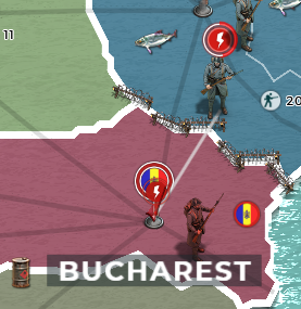
    - Unit icons act funny. They don't represent where the army is actually located, which is confusing. For example:

    93654a51ae5ba7c301e623057dfb55d7.png


    My army is attacking Bucharest, but appears to still be in Ukraine. It's easy to tell what's going on with a detailed look, but this is a major downgrade from how easy to understand the map used to be.


    - My flag is squished. It used to scale properly, but now it appears laterally squashed and heavily compressed, which makes it hard to see the details on it. I made it specifically for this purpose, so I'm sad that it's not displaying properly.

    bd15fb7f97742536b7344bfe78242fad.png


    Compare to:

    GpzhfdB.png


    - I would really like the option to revert to 2D icons for units. The 3D models are pretty cool, but it makes it hard to see big menacing stacks. The models could also be shrunk at max zoom; they take up a lot of space.


    Bearing in mind that the backend is the same made it pretty easy to adapt to the new UI for me.


    I love the more modern feel of the UI and the map in particular feels nice to navigate, though I would like more control over the colors and icons. The barbed wire between warring nations is a great touch.

  • God no! A slap in the face to old-timers who play this game for the board game feel.


    No new mechanics or choices or units? Just flash and bang and shiny things to distract from the lack of new content or ideas.


    Another nail in the coffin, perhaps the last

  • God no! A slap in the face to old-timers who play this game for the board game feel.


    No new mechanics or choices or units? Just flash and bang and shiny things to distract from the lack of new content or ideas.


    Another nail in the coffin, perhaps the last

    Emmm...:/

    The third and final stage will be reached in mid-2019 with a major content and feature update.

    https://www.youtube.com/watch?v=-HA8kSdsf_M


    Soldiers! don't give yourselves to brutes

    men who despise you, enslave you

    who regiment your lives, tell you what to do

    what to think and what to feel!

    Who drill you, diet you, treat you like cattle,

    use you as cannon fodder.

    Don't give yourselves to these unnatural men

    machine men with machine minds and machine hearts!

  • Please make it to where you always have the option to at least play in legacy mode. I for one will end up leaving it that option goes away.

    Not an option the update was needed to prepare the system for future improvements. E.g. the mobile version and the steam release.

    I do remember a lot of people saying the same when we changed to HTML5 btw and in the end yes we lose some but a large number of the "I will certainly go away" stayed eventually.Give it time give CONSTRUCTIVE feedback and walk with us to the future. As no update was the lesser of 2 evils compared to this update. We need to get rid of legacy systems to change supremacy2009 to supremacy2019, this is impossible without your, constructive, feebdack. Keeping legacy around will be deathweight in the future rendering void the systematic improvements made in this revamp

    NarmerTheLion
    ex - EN Senior Moderator


    Questions about the game? Have a look at the manual and the FAQ's.

    Need game support? Send a ticket or contact the crew.

    Have an idea for the game? Check the BigList.

  • I would like to be able to toggle new message bubble for global chat. it's very busy and the number keeps racking up and only way to clear it is to open the chat. I would like to be able to select only my alliance chat as an option for chat notifications etc.

    Additionally, not sure if a bug or expected, but the way armies are being drawn on the map is very confusing. i can't tell whether units are on a road or on a structure or otherwise with any view settings: https://i.imgur.com/pczta6M.jpg

  • Not an option the update was needed to prepare the system for future improvements. E.g. the mobile version and the steam release.

    I do remember a lot of people saying the same when we changed to HTML5 btw and in the end yes we lose some but a large number of the "I will certainly go away" stayed eventually.Give it time give CONSTRUCTIVE feedback and walk with us to the future. As no update was the lesser of 2 evils compared to this update. We need to get rid of legacy systems to change supremacy2009 to supremacy2019, this is impossible without your, constructive, feebdack. Keeping legacy around will be deathweight in the future rendering void the systematic improvements made in this revamp

    Im afraid i will really leave if thats the case, i tried call of war and kingdoms but i didnt like either of them because of the UI and the 3D units, i thought supremacy always had the superior UI and mechanics and if it really cant be stopped i think it really is a shame.

  • I would like to be able to toggle new message bubble for global chat. it's very busy and the number keeps racking up and only way to clear it is to open the chat. I would like to be able to select only my alliance chat as an option for chat notifications etc.

    Additionally, not sure if a bug or expected, but the way armies are being drawn on the map is very confusing. i can't tell whether units are on a road or on a structure or otherwise with any view settings: https://i.imgur.com/pczta6M.jpg

    Seems like a bug indeed


    Im afraid i will really leave if thats the case, i tried call of war and kingdoms but i didnt like either of them because of the UI and the 3D units, i thought supremacy always had the superior UI and mechanics and if it really cant be stopped i think it really is a shame.

    SO be it, it is a shame people leave due to this. But standing still was going backwards sadly enough

    NarmerTheLion
    ex - EN Senior Moderator


    Questions about the game? Have a look at the manual and the FAQ's.

    Need game support? Send a ticket or contact the crew.

    Have an idea for the game? Check the BigList.

  • The functionality of Supremacy 1914 has decreased beyond the point of being a playable game due to what to a great extent is a cosmetic makeover that I do not even find more attractive. The aesthetics of the new layout/layover is matter of opinion, but that it makes the game hard to play and operate is a matter of fact considering the following:


    1) A supmap essentially consists of vertices (cities and intersections) and nodes (roads and sea routes) between them. Concerning movement and local relations on the map everything else is irrelevant, but the graph/movementgrid is very obscured in the current version.


    2) A supgame consists for an important part of the movement of units on the mentioned graph/grid. The display of these units is not clear at all and I am forced to resort to the pindisplay with the disadvantage that I am not aware of the exact composition of a unit in the blink of an eye.


    3) Planes do move between points of the map instead of roads, but I consider their movement to be even more opaque in the new version.


    possible solutions:


    1) Roads and intersections need to be crystal clear. Can adjusted contrast and colors manage that?


    2) Improved pin-display: make the exact composition of the unit directly visible (how many art/other tech exactly). (Perhaps even try to improve their attractiveness by using something else than the present pins. The good old java version e.g. used classical military unit display, which looked really nice.)


    I am not going to open a game in December, since the old version is probably only around for two or three months and I really do not want to be confronted with a late stage game that is unplayable and that I will certainly not enjoy.

  • If you have different types of units stacked like artillery and infantry or tanks and infantry it only shows the artillery or the tank and then a number to indicate the infantry, when they are stacked like this the artillery/tank/whatever that is not infantry has the same icon which is very confusing

  • Message received from ischmalud


    Ahoihoi and howsit

    Now first off I like that they try to spruce it up make it hip and what not since the game did look dated.

    But right now I encounter at least 2 bugs that seems problematic.

    1 rail cannons are invisible somehow in the new UI.

    I have a match where I know exactly where said cannon sits - since fat mike needs a lot of attention.

    2 seems everything NOT infantry has the same icon now and gets bunched - I am not sure if that's a bug or meant to be but its an issue.

    Having a stack of artily in a province is not the same as a stack of armoured cars.

    Some loon recommended memorising all your armies...I mean....come on I like to play several matches parallel since lets face it vast majority of time you just plot and scheme and that's it.

    But now not being able to see what i have where at any time - and more importantly what has my enemy got - assuming my spies didn't slack off....

    that seems like a step in the wrong directions. By all means keep the flash now textures they DO look better than the old crayons in kindergarten thingo. But not if it means I spent my time with stupid busy work rather than conquering the world - as is my rightful course as supreme Emperor Ischmalud of the anointed Spaghetti Bowl!

    Whitetiger89

    Community Support

    Bytro | Supremacy 1914 | Community Coordinator

    Bytro | The Great War | EN Game Operator

    Bytro | New World Empire | Intl Senior Moderator


    Questions about the game? Have a look at the manual and the FAQ's.

    Need game support? Send a ticket or contact the crew.

    Have an idea for the game? Check the BigList.

  • Thank you all for your constructive criticism and thought-through feedback. We are ready to tweak the current implementation of the new map view in various regards and we rely on your feedback. While it will not be possible to please everyone our goal is of course to make the game visually appealing AND easily playable. If the current map view doesn't strike this balance yet, we will have to readjust.

  • First at all, I'll add images with examples of the issues I mention here when opportunities arises.


    Second, in this topic I'll make the comparative between Legacy map and Frontline map where the former is better than the later, with the goal the GO and devs makes the proper corrrections over the beta version. Because of that, this topic will be heavily edited as I'll add the aforementioned images.


    1. As you can see, I can outfocus the map in Legacy almost totally, that allows comfort to the user when he needs to manages troops in the extremes of the map. In Frontline, that's not longer possible and that comfort disappear (we need to zoom in to do the same management)


    2. Do I need to move troops to a point outside of the screen? Legacy allows me to do that with no problem. Frontline, instead, not. For that, I need to select the troops and click on "move" option. Even then, the displacement isn't automatic as in Legacy, but I need to keep pressing the click to move the map for moving the troops outside the screen. In other ways, devs made complicated a simple feature.


    3. This is, possibly, the greatest criticism many users has made about the new map when compared with the old one: in Legacy, you get a complete accountability of your army composition in a determinated place (infantry, cavalry, tanks, heavy tanks, artillery, armored cars, etc) without even select that army. Frontline, instead, just shows you the 3D unit who give the name to that army (that only suggest that army have, at least, one of those units. Still, I think that 3D unit is a good addition) and a shallow, even lazy, accountability of the army composition (while Legacy shows you have 28 infantries and 8 cavalries, Frontline just says you have 36 "human units"; while Legacy tell you have 5 artilleries, 5 light tanks, 2 heavy tanks and 8 armored cars, Frontline just tell you have 20 "mechanized units") that compelled the user to click on that army to receive a more detalled composition, that wasn't needed in Legacy.


    4. The same images also shows another problem: the actual location of the armies in the map. Legacy is very clear signaling the army is IN the city; Frontline suggest you the army is OUT of the city. That's something totally and unneedly misleading for the user.


    5. Continuing with the misleadings, in these images we can see Legacy shows us the exact location of the troops moving. Frontline, on the other side, want to indicate us the same things with white lines almost totally indistinguishable with some colors in the map (unlike Legacy, who give us that indication with well-defined black lines) and, as you can see with the arty, totally unneeded when that arty can be put on the road to show us its actual position. So, if you combine points 3, 4 and 5, the conclusion is that Frontline map gives the user unreliable information about the military situation.


    6. There is also complains not only about the 3D units being gigantic when compared with the cities (in contrast with Legacy, where the size units are reasonable) but with the infantry being the most gigantic of all units (including cavalry or tanks). Of course, that disproportionated size takes realism away from the game.


    7. Look at the disastrous disorder Frontline map show us when we are in the fight meleé. Legacy, as you can see, is pretty tidy when show us the battle dispositions in the camp. The new version, instead, (and in accordance with the unreliable info it gives us) put the enemy in a route they aren't (just because my 3D horse unit are in their way) and made them look like they're attacking my artillery. Besides, put reinforces from Guayaquil farther than they are in reality.


    8. Another irritating thing: When we enter at the diplomatic section, messages & trades subsection, the predeterminated view, in Legacy, are the last messages written between people. In Frontline, are the first messages, so we need to scroll down to arrive to those last messages (that, if the page doesn't reupload itself, in which case, she automatically redirect us to the first messages, forcing us to scroll down over and over again). Besides, Frontlines doesn't remember the last subsection we were, so the information subsection is always the first to appear (unlike Legacy, where the system remember the last subsection we visit)


    Greetings.


    P.D. A little bonus about point 5 aforementioned:


    Where are the location lines for the tank and the artys? Of course, they aren't in the location the map put them... Anyway, like I would say in spanish: "¿Donde está la bolita?, ¿Donde está la bolita?"

    Demonaire
    ES. EN & PT Game Operator

    Bytro Labs | Supremacy 1914


    b78//+

    All the things you need to play this game can be found here, here and here.

    Do you want to experience new ways to enjoy Supremacy 1914? Click here and here.

    Have you problems with the game? Send a ticket.


  • It's a shame the Frontline players weren't listened to a bit more before introducing this to everyone - there was always going to be a bad reaction the way it is now - the game is bordering on unplayable and the comments I am seeing on this thread are no different to what was being said on previous threads.


    I have already heard from a number of players they will finish the maps they are in while they can still use legacy mode and then move on to other games. I'd like to say I will be staying but I find no matter how much I try and make myself use the new look I soon find myself reaching for the legacy mode button just to confirm everything is how it should be. Once legacy is gone I really don't know if I will be able to keep playing. As far as mobile & steam platform go - I can't imaging trying to play this on a mobile screen, it is hard enough when I use a 7" tablet in emergencies. Steam - ugh, not a fan, the last game that went to steam I ended up leaving because of other issues. Will we still be able to play through a browser when it is launched on Steam?


    It is still quite buggy too - often I need to refresh a couple of times just to get the units and cities to show on my screen. I'm not going to cover all the points I have already raised other than to say Bytro really need to listen to their consumers and not assume this is what we all want, I acknowledge this has taken a lot of work and probably a kick in the teeth for the dev team to read a lot of negative feedback. It's not all terrible, a lot is just a matter of getting used to the new look and working out where everything has been moved to - but the actual map itself, if we can't tell where our units are or their composition, who our enemy is, where our borders are, what buildings we have etc etc then people will simply stop playing and in many cases not through choice they literally will not be able to play.


    I will say this, and i think it has been lost over time - there is a reason we all play this quaint dated game - we play it because it is quaint and dated. We love the simplicity of the UI which does not detract from the game play. It appeals to us BECAUSE of all the things you are taking away, if you truly don't care about people leaving then carry on but if you want to retain your user base then please listen to us and find a compromise we can all live with.