[S1914] Legacy-Removal Feedback Thread

  • Today there is news:

    "We improved the game"


    What I noticed is:


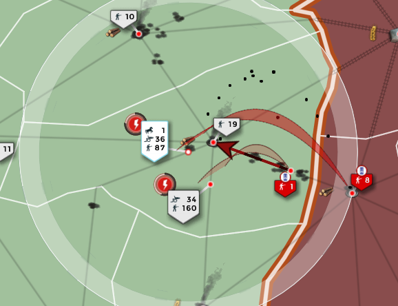
    All mechanical units now have the label clearly above the unit.

    Together with other units --- well, hard to tell, hard to see...


    Is that the announced change of unit symbols Freezy was talking about?


    perry89. on August 16, 2022/7:36 p.m


    ---


    edit on August 17, 2022/9:24p.m

    OK let's see

    the timestamp "yesterday, 7:35pm" is correct

    but it took almost 24 hours to publish/approve.


    I'm a bit confused that the moderator "sonja1976"

    posted a message around 3pm, but my message wasn't approved until 6 hours later.


    Is that normal:

    the delay...

    the 24 hours till approvement...

    or do I something wrong?

    or have I something to pay for service?

  • lost realist.. you forget something... they kept legacy going till now.. so no need to implement them..

    as its gone now there is a new and totaly diffrent sitiuatiuon dont you agree

    I do agree, but don't you agree that that's a little sad? For all we know they had oh so many players playing the new UI, but implementing things that experienced players consider improvements to it being put off until now instead of spending the time with both clients running to bring the new one up to the previous standard? I think it's sad. And to then come up with things like "well there hadn't been any actionable feedback the past few months" for excuses is flagrant. And to then now come out with update after update on game mechanics literally nobody had asked for while our suggestions collect more dust without even acknowledgement is insulting.

  • Hmm i do understand your point LostRealist the problem is they need a good working version you can play mobil too on nearly any device. with legacy thats rather hard. Besides the fact some new things and units they are working on are rather difficult to put into legacy.

    Basicaly its has become a oneypit. I do understand that. I dont have to like it lol.

    If they want to keep this game free to play for most players as it is now they have to comeup with a solution that works and unfortunatly legacy does not fit in that solution.


    I don't give a jack about legacy and how unprofitable it apparently was, steering everyone involved with its maintainment and development into unavoidable poverty.

    My point was that there was never a need for its successor to be the way it is. And that it could have been improved since the day it rolled upon us. But it is, and then it wasn't. At least not in meaningful ways. Saying how bad Legacy was doesn't make the new client any better at all.

  • As a player that began with Java, I find that the new format is far friendlier than those of the past. Granted, it has it's issues, and does not compare to the exploits we have become used to using in game, but all new things have room for improvements. Cars. Rockets. Jets. Computers. Brain surgery. Games. Constructive feedback on what NEEDS to happen is far more constructive than simply pining for the days gone by and complaining about where we are.
    And where we are is not necessarily lost, we are simply getting our bearings. What was is no more, but what is can be improved upon requires feedback. Help with that.
    Just another opinion added to the ever increasing pile here.

    A half truth is merely a half lie.

  • Hello,


    Is it planned that a filter be added to the existing ones in order to display or not the symbols of the units on the map so as to keep only the "flags" with the number of units of the army ? (for more readability)

  • Hello,


    Is it planned that a filter be added to the existing ones in order to display or not the symbols of the units on the map so as to keep only the "flags" with the number of units of the army ? (for more readability)

    Yes, it will get released next week with the update, due to popular demand. It will be in the "unit icons" section in the map filters menu.

  • can fire icon be placed on the right side of the unit so it doesn't hide delay icon on the left side?


    also i have noticed that it F11 full screen ode pressing top right X button in Spies menu does not allow you to leave


    i noticed too that many times server did not pick up my order to split units and go to different town. Seems like refresh button in-map is completely dead and only refresh button of the browser works and allows to refresh GUI and separate units.

  • Hello,

    It is appreciable indeed, but not perfect.

    Would it be possible to have the same, but without the white flag?

    If implemented, unit display would be similar to legacy mode.


    Currently if you have a lot of units in one place, the white flags overlap.


    A possible point of improvement would also be to add a filter to display or not the delay before the next shot. We already have the information in the banner when we select a unit. it unnecessarily weighs down the visual.


    qzak.png

  • Wow this is amazing. When I get a little bit bigger I will definately be using this in my current 500 map. Hopefully this helps a load with the lag.

    d2b685b943ceeb3.jpg


    <A Soldier's Strength isn't Measured by the Size of his Axe, but by the Size of his Heart>

  • its a nice update, though disabling the sprite doesn't seem to help with the blank army labels on late-game 500p maps.


    but on the bright side, disabling allied/neutral units seem to help with this problem

    Any sufficiently advanced tactic is indistinguishable from magic to the uninitiated.

  • So then.... Having read portions (Certainly not all of the 18 pages) and as a player who has not been active since 2017...

    Is it a good time to invest energy in relearning the mechanics of this game or am I better off remembering found memories?

  • So then.... Having read portions (Certainly not all of the 18 pages) and as a player who has not been active since 2017...

    Is it a good time to invest energy in relearning the mechanics of this game or am I better off remembering found memories?

    Not much to learn, just go through the last few release notes - mainly the bigger changes and no bug fixes. The devs don't spend too much time on this game as compared to their other games - and also don't change the mechanics too drastically.


    The main difference since last time is that units have much more anti-air capabilities, which wasn't the case a few years ago where bombers had superior advantage. There are a few others that might be relevant to your play style.

  • I really dislike the new UI. Its to fancy. The layout overall is just confusing. I played supremacy since 2013. The lagacy mode was just simple, everything was clear you could see everything clear.


    I hope Bytro brings back lagacy mode. I really loved this game but with this layout i cant touch the game again

  • also don't change the mechanics too drastically.


    The main difference since last time is that units have much more anti-air capabilities

    Many changes since 2017 (Before my time), Starting with 2019 roll out of Mobil App which brought influx of high activity players to s1914 and removal of Legacy display , removal Unit TRADEs, also change to Call of WAR combats mechanics is rolling out (fighting planes portion of CoW is already implemented). Biggest change in S1914 is the graphics and Ultimate Immersion interface IMO

    index.php?eID=image&uid=11763503&mode=2

    Embrace your true nature , enjoy games and have fun!